The cartographer's art


By Ginny Privitar
WEST MILFORD ‑‑ Where would we be without maps? Would any of us get where we're going? Or even know about places we've never been? And after Columbus' trip to the New World, would shiploads of immigrants have made their way here without maps to guide them?
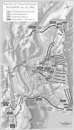
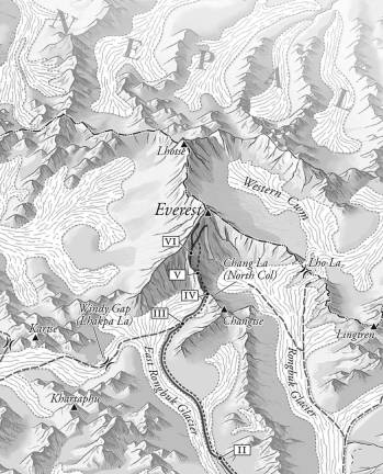
Longtime resident David Lindroth is a mapmaker, or more properly a cartographer, who takes pride in making excellent maps. His customers are major publishers and his maps have been read, scrutinized and enjoyed by schoolchildren, travelers and the public at large.
His creations have been used by the New York City Visitors Bureau and by Fodor's, for their travel books. Current customers include Random House, Knopf Doubleday and Simon & Schuster.
Lindroth said, "I was always interested in maps from the time I was a kid." He attended Drew University where he majored in art and graduated from Rutgers University with an M.S. in Fine Art in painting and sculpture. After graduation, he needed a place to work and "was going around cold calling ad agencies and one day I walked into Harcourt Brace & World (later succeeded by Houghton Mifflin Harcourt) and they needed someone to work in the map department." One year later he moved to Macmillan and became a map editor for textbooks. In 1971 he became a freelance mapmaker. He also worked for Readers Digest for eight years as a book designer for their DIY books on home repair.
In 1983, he left Readers Digest and incorporated as David Lindroth, Inc. Lindroth was in the business when illustration was done by hand with pen and ink or with technical darkroom work ‑‑ before the digital age. It would be difficult today to find people with those skills. Lindroth says occasionally he still uses pen and ink to get the right effect, but most of the time he's using software tools that emulate an ink brush on the computer.
Lindroth was always forward-thinking. "We were probably one of the first companies to use Adobe Illustrator to produce a large set of commercial maps, he said. At the time, Fodor was redesigning their books and Lindroth talked their art director into using Illustrator for maps, and creating the legends in Quark Express. This was back in 1988. It was one of the first big jobs using Illustrator. After that, other publishing companies began using the software instead of traditional methods. Lindroth noted with digital design you can see onscreen how it looks and make adjustments as you go, compared to the old methods, where you wouldn't know for sure what it looked like until it was printed. Now Illustrator is used almost everywhere.
What goes into making a good map? "You have to have a command of history and geography at your fingertips," Lindroth said. "It's a technical and art process combined with editorial and intellectual activity that goes into the production." Will it explain and illustrate its purpose?
"You need clarity in a good map; you want something where the design does not overwhelm readability," Lindroth said. . If you try to cram in too much information, it will be too small. Write the text ‑‑ like street names ‑‑ too large and they'll crash into each other. The cartographer has to figure out how to make the map as clean and informative as possible, so it is easily read and understood. Even what we think of as decorative maps were meant to be used.
Color is important, he said. The more color you have to work with, the better you can distinguish places, but too much color leads to confusion. If different shades of a single color are used, there must be enough differentiation for the reader to discern different areas.
Map choices involve the type of map projection (style) and which data to include: streets, cities, points of interest. Too much detail leads to clutter. The mapmaker has to make sure information is current; for example including new streets or developments and making sure names are updated. Color choices, line widths, icons and labels all must be considered. The legend, which incorporates symbols or colors to identify places on the map, is very important. In order for a map to communicate clearly it must suit its intended audience. A map for children, for example, would be simpler, and perhaps more colorful than a map for adults.
Perhaps most important is good design, clearly and cleanly rendered by a cartographer who cares deeply about his craft. Think about this the next time you look at a map.
David Lindroth Inc.
85 Broadway
West Milford, NJ, 07480
Phone: (973) 697-1965
Davidlindrothmaps.com